Personal Logo Set/Brand Identity
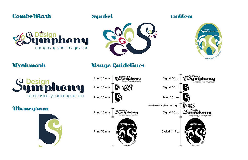
Design Symphony
Design Symphony is my creative graphic design logo. I selected colours that I am drawn to and sourced them from the watercolour painting I use for my branding. I created a peacock from the “S” in Symphony. The peacock is a symbol of spiritual awakening and transformation. I felt it represented my creative journey towards fine art and graphic design.
I chose the name Design Symphony because it represents a part of my creative incubation process. When I listen to music it paints images in my head. If I’m creative problem-solving, this process of listening to music allows me to access my creative subconscious.
My logo and my brand are a combination of my design skills and my fine art skills. I used my watercolour painting throughout all my branding. I wanted to highlight that not only am I a Graphic Designer, I am a Graphic Artist.